


Typography is THE MOST underrated design element.
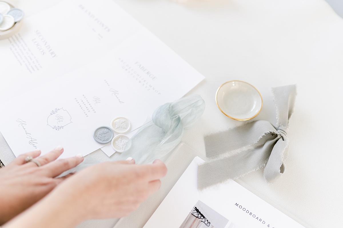
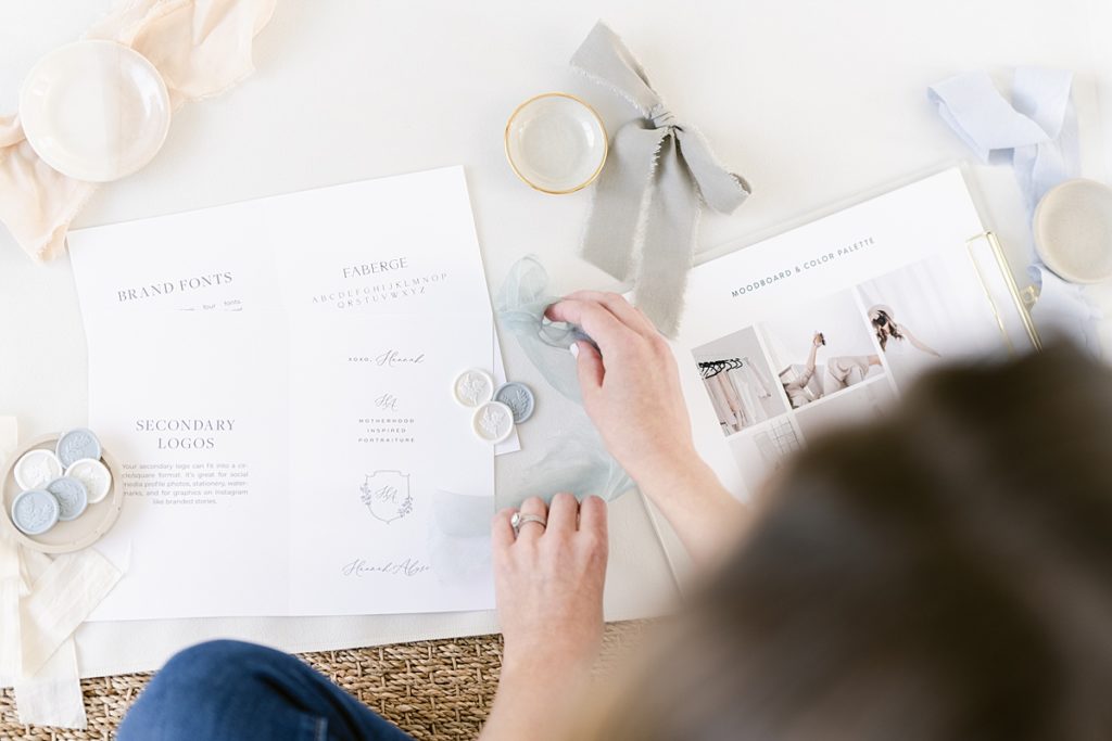
People get caught up in the pretty graphics, the colors, logos, and moodboards that come with the design process, and I don’t blame them! It’s lots of fun. In comparison, the font palette I provide doesn’t get as much attention but poor typography can make the prettiest of website templates look amateur and unprofessional.
Good typography is important because it….
Establishes hierarchy
Typography literally helps organize your content and helps readers know what’s important, what order to consume the content. It also makes content easier to consume when done the right way.
Sets the tone
Typography is another way to help set the tone for your brand. Is your brand classic, elegant, and feminine? Good typography will reflect that and help enforce that aesthetic in your viewer’s mind.
Encourages recognition
Typography is another way to help promote brand recognition – when you use it cohesively.
Creates a good user experience
In ALL of these things typography creates a good user experience by promoting legibility, organization, etc.
Every custom brand I create walks away with a curated font palette whether I’m doing their website or not. That way, they can follow the guidelines and stay as cohesive and professional in their type usage as possible.
Every font palette should have…
Contrast
Having good contrast is important. Think small, large, thick thin, serif, sans serif. Adding contrast adds visual interest and is crucial for establishing hierarchy.
An easy to read body font
Not just any font can be used for body copy. Using a legible font is necessary – I like to avoid display or overly detailed fonts. Serifs or sans serifs can be used as long as they’re readable.
Fonts that reflect your brand’s aesthetic
All fonts used should support your overall brand aesthetic whether you’re a classic, high end brand or a modern, chic brand. For example, I wouldn’t choose an old fashioned serif for a brand that’s modern.
Balance
I always avoid using all caps for anything other than titles or short phrases. The same goes for scripts – no matter how legible the script, they’re still much more difficult to read than serifs or sans serifs so they shouldn’t be used for long stretches of text.
In the month of March, I’m talking all about typography on Instagram. If we’re not hanging out there yet, head over and follow me to continue the conversation.
Lyra Studios creates purposeful brands for women in business so they can be recognized in luxury markets and build connection at every touchpoint. If you’re ready to ditch the DIY cycle and create a brand that will help your business grow, get in touch and let’s get started.


