


Showit is my absolute favorite website platform. Its user-friendly drag and drop platform makes it easy for anyone to update copy, colors, images, and more in a snap.
The one downside to being able to move and change everything is that things can get pretty messed up pretty quickly. I very often see websites that started off with a stunning, swoon worthy template just to end up looking pieced together.
Today, I’m going to share how you can avoid this fate in your own website but *first* I’m going to give you some key indicators to me as a brand and web designer that a website was DIYd. Let’s dive right in, shall we?
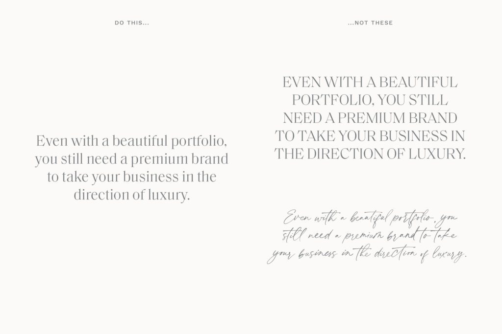
Inconsistent typography or poor typography use
Too many fonts
Font styles that are way too large or way too small
Inconsistent font styles
An overuse of script fonts
Long stretches of text in all caps
Poor color usage
Using colors together that don’t have enough contrast
Using text over the wrong colored background or a busy image (again, not enough contrast)
Using TOO many colors
Inconsistent use of colors
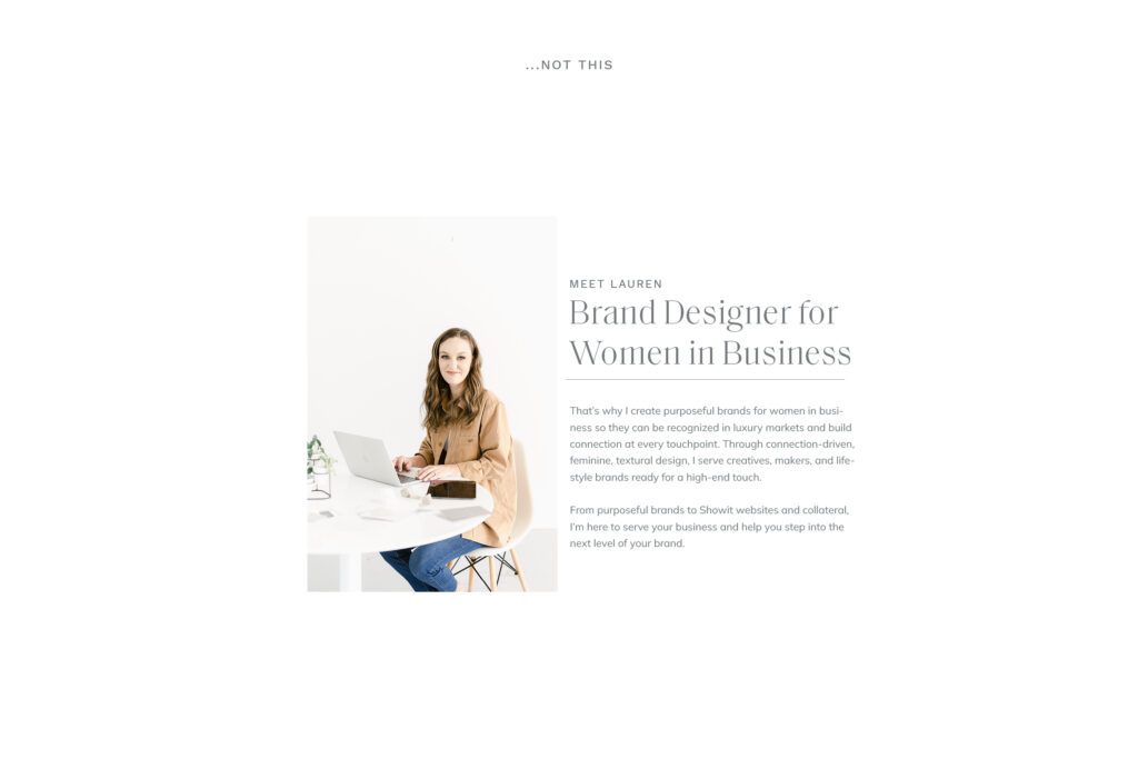
Spacing issues
Inconsistent spacing between elements
Too little white space
Too much white space (that was not intentional)
Crowding between elements
While this is not an exhaustive list of indicators that a website has been DIYd, these are the issues I most commonly see when looking at small business owners’ Showit websites.
So often, people feel like they need to jazz things up with their template to make them stand out but trust me friend, less is more when it comes to changing up your template. I always suggest picking the template best suited to your needs and making minimal layout changes.
Customizing your website template like a designer starts with picking the right template. Not all templates are created equal. Template shops I recommend are
Lyra Studios (of COURSE)
Tonic
With Grace and Gold
Starting with a quality template will help ensure a quality final product.
Once you’ve picked your template, there are some things to consider when it comes to customizing it beautifully:
Typography
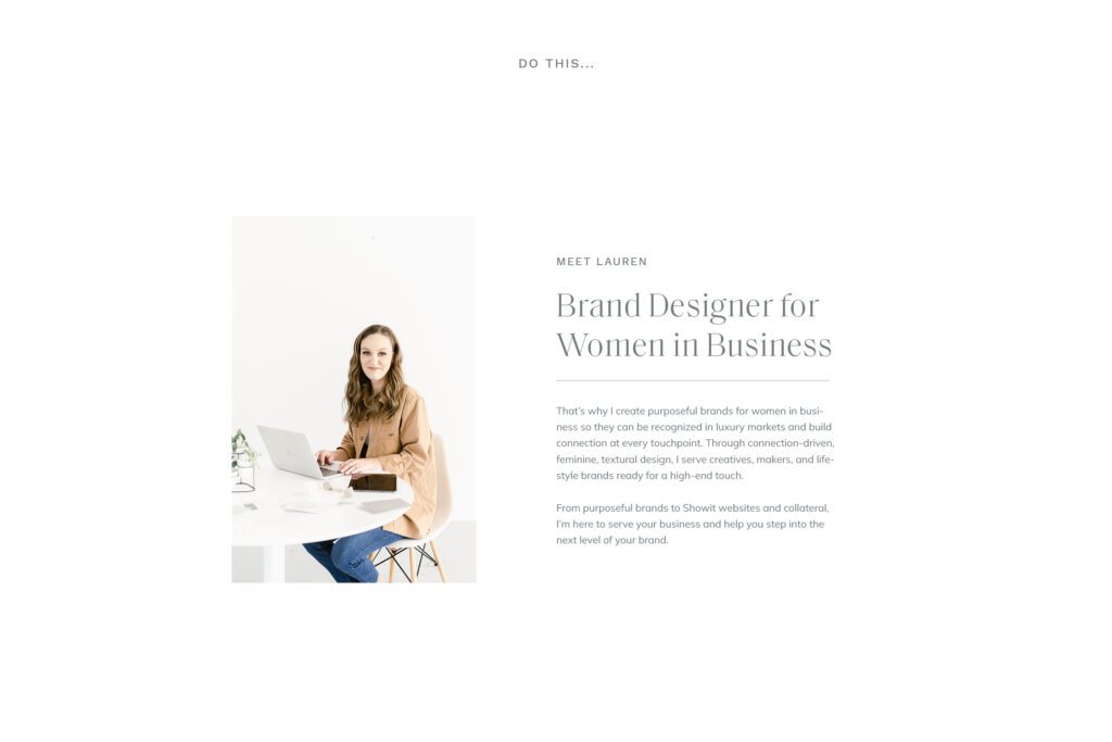
Typography is one of the most underrated yet high impact ways to ensure your brand and website feel high end.
Some things to keep in mind are to:
- Establish your font palette and keep consistent. My one gripe about Showit is that I often do want *one* more style (usually another subheading) than they have room for so if you decide to add another style, keep track of it somewhere and stay consistent with it.
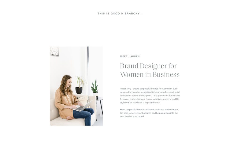
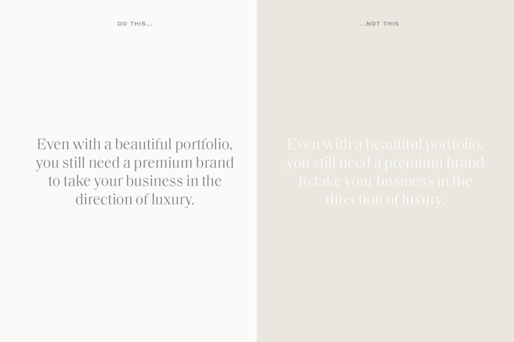
- Make sure your font palette has good hierarchy. Hierarchy helps organize information and helps us know what to look at first. Make sure there’s a decent difference in size between headings and paragraphs, for example. Make sure paragraphs aren’t crowded – set the line height slightly higher so there is space between lines.
- Avoid long stretches of text in all caps or scripts. PLEAAASE no paragraphs especially! As a general rule, all caps are suitable for titles less than 10 words and scripts are suitable for short words or phrases (think 3-4 words tops). This helps ensure maximum legibility which is important when it comes to keeping website visitors on your site as long as possible.
Color Usage
- Keep color usage consistent, and don’t use too many colors in a design. Showit allows for way too many colors, in my opinion. This varies between brands but on average, a dark and light neutral, white, and a couple of main brand colors are more than enough for your website.
- When using colors together, keep the contrast high. If you have a colored background for a section, make sure the color of the text or elements is a high enough contrast to ensure legibility.
- When using text over an image, make sure the image is light or dark enough, or use a color overlay to ensure that the text can be easily read.
Spacing
Spacing is such a tricky one but it’s SO important to ensure a balanced layout design. What I like to do when customizing for my clients is to keep track of what the typical spacing is between elements (for example, spacing between a subheading and paragraph, etc) and make note of it so I can stay consistent as I move things around or add more text.
The way I do this is to add a rectangle to the canvas and size it to fit between elements so I can see how many pixels there are between them, then delete when I’m done. Maybe there’s a better way to do this? If so, I haven’t found one and this works quite well for me.
Make sure your elements are balanced, not too crowded and not toooooo much unintentional space between.
White space is super important, though. Make sure there’s plenty of breathing room between the top of the element and the edge of the canvas.
Taking the DIY route can be tricky, but it’s necessary sometimes. Use these tips when you’re working on customizing your template.
If you’re OVER doing it yourself though, reach out and let’s chat about getting it done for you. 🙂
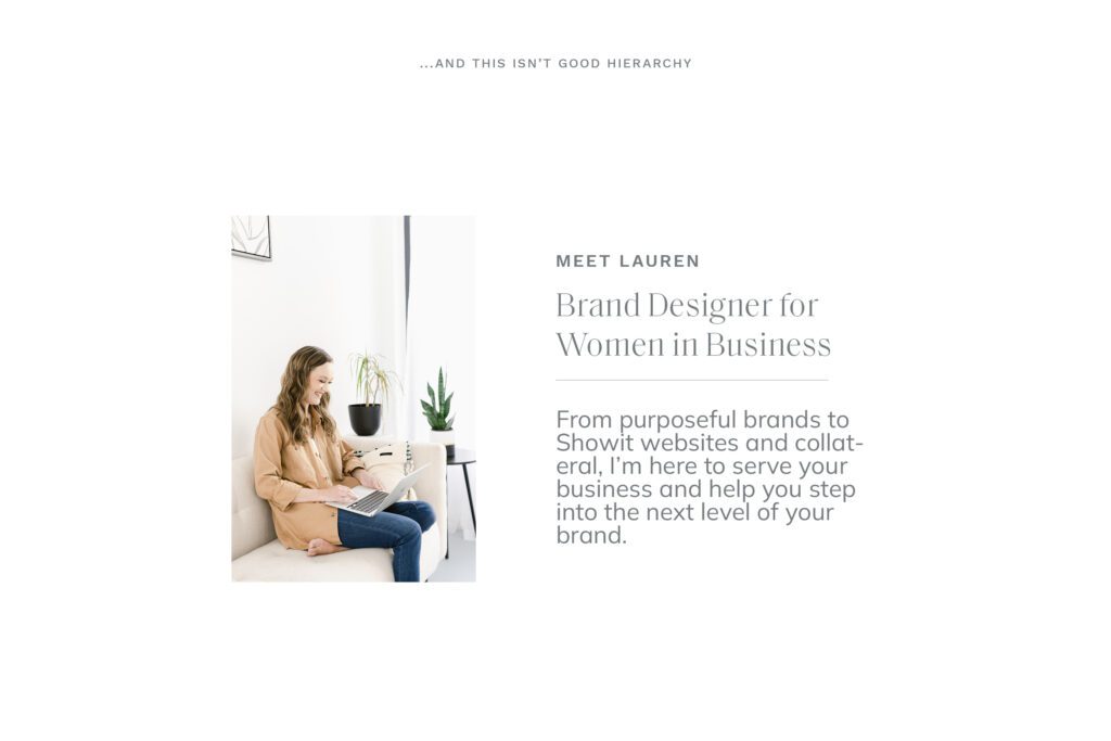
Lyra Studios creates purposeful brands for women in business so they can be recognized in luxury markets and build connection at every touchpoint. If you’re ready to ditch the DIY cycle and create a brand that will help your business grow, get in touch and let’s get started.


